ThreatLens Dashboard
ThreatLens dashboard contains all the details about the threats provided by Bugsmirror Defender. It is divided into four sections: Latest Threat activity, Threat, User and Device.
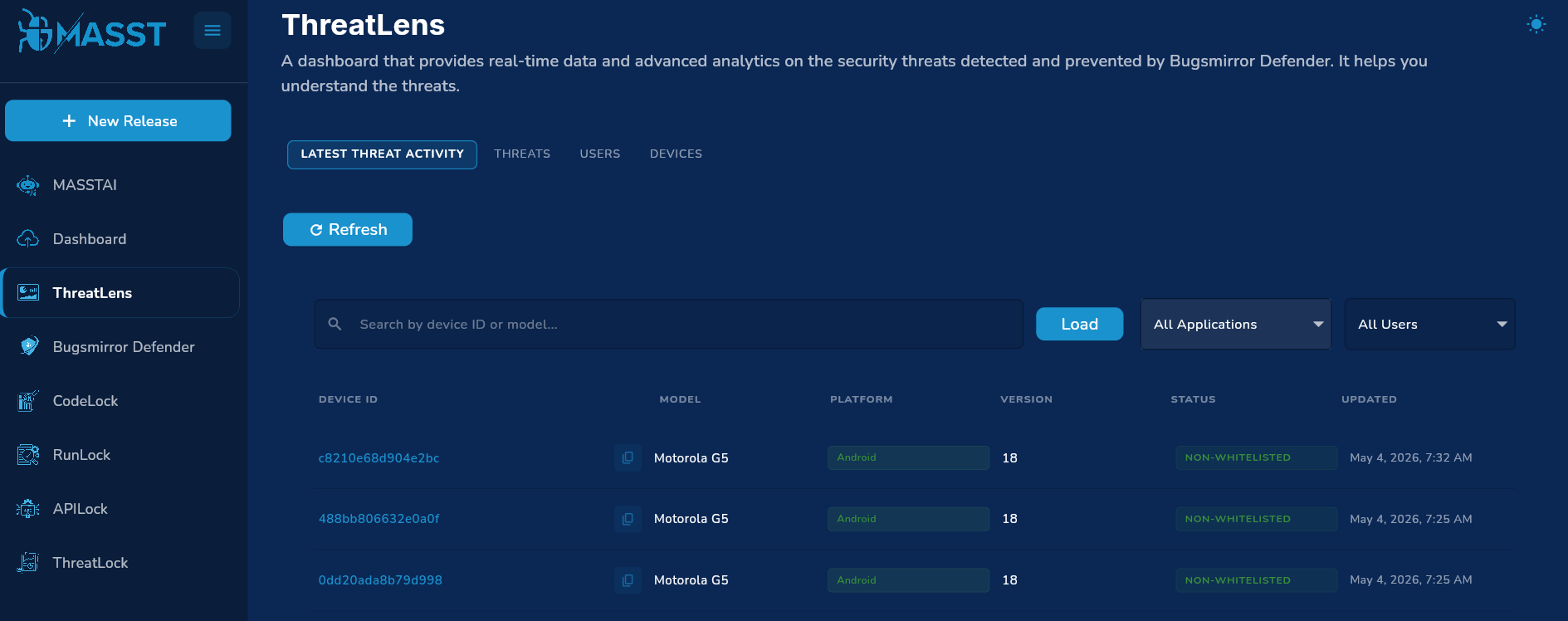
1. Latest Threat Activity
This dashboard provides an operational, event-level view of threats as they are detected.
For each device and threat event, users can see:
- Device identifier and model.
- Operating system (Android/iOS).
- Application where the threat was detected.
- Threat name, classification/group, and severity.
- When the threat was last detected and how recent it is.
- Whether the threat/device is currently whitelisted.
There is a search section where you can search users by device ID or mobile model.
Img:1 Latest Threat Activity
Search & Filtering
Users can narrow down threat activity by:
- Device ID – Show events for a specific device ID.
- Device model – Focus on a model across many devices. Please load more devices by scrolling down to increase the scope of selected devices.
- Application – Application drop down: you can check all the users for all the applications you have added in the MASST portal.
- Whitelist status – Show all threats(whitelisted or non-whitelisted) or only whitelisted ones.
Threat History per Device
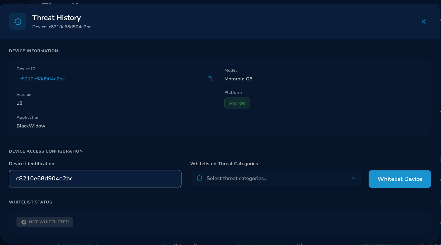
Img:2 Threat History Dashboard
On clicking an user, you will see a Threat History dashboard. From any device, users can open a history view to see:
- All historical threats recorded for that device.
- How the type of threats evolved over time.
This provides time-based threat activity at a single-device level.
Pagination and Volume Indicators
The tab provides:
- Loading more history while preserving existing filters.
2. Threats Tab
The Threats tab provides aggregated analytics on threats across devices, users, applications, and time.
2.1 High-Level Threat KPIs
For any selected app/time window, users see:
- Total threats – Total number of detected threats in the period.
- Peak day – The date with the highest number of detected threats in that period.
- X-day average – Average daily threat volume over the selected period.
Various charts are available:
Daily Threats count
The graph shows daily, weekly, and monthly threats with date. Red shows peak day and blue line shows threat count.
2.2 Time-Series: Daily Threat Volume
Users see how total threat volume changes over time:
- Threat counts per day/week/month depending on the selected window and bucketing.
- Peak volume highlighted vs typical days.
- Average line indicating normal behavior.
Note : This data is not available if the time filter is yesterday.
2.3 Threat Types (Threat Count by Name)
Analytics around which threat types are most common:
- Distribution of total threats by threat name (Threat ID).
- Ranking of most frequent threat types.
- Ability to focus on a subset of threat types.
This helps users see which threat types are dominant and whether any new or rare threats are appearing.
2.4 Threat Groups / Classifications
Threats are grouped into higher-level classifications such as “Device Integrity”, “Secure Communication”, “OS Integrity”, etc. Users get:
- Overall volume per threat group.
- Within each group, the top sub-threats and their counts.
This provides a high-level understanding of what kinds of threats dominate the environment.
2.5 Threats by Application
Users can view threats broken down by application:
- Total threat volume per app for the selected period.
- Top threat types and their unique threat counts per app.
This helps users identify applications associated with high threat volumes and compare exposure across apps.
2.6 Threat Timelines by OS, App Version, and Device Model
Users can analyze how threats evolve over time across three dimensions:
- By OS version – Volume of threats per OS version (e.g., Android vs iOS).
- By app version – Volume per application version.
- By device model – Volume per device model, revealing model-specific risk trends.
This helps users see how threats correlate with OS versions, app versions, and device models across time.
3. User Analytics (Users Tab)
The Users tab focuses on user-level exposure and risk.
3.1 User Exposure KPIs
For the selected time window and app(s), users see counts of:
- Total Active User Count - Total Active User count
- Total flagged users – Users with at least one detected threat in the selected duration.
- Total Whitelisted users – Users that are whitelisted and used application in the selected duration.
- Flagged Percentage – Percentage of Flagged Users over Total Active user count on the selected duration.
- Whitelist Percentage – Percentage of Whitelisted User over Total User Active user count on the selected duration.
3.2 User Timeline
Users can analyze trends in user exposure over time:
- Daily total /flagged / whitelisted users – Number of active users each day in that duration.
- Daily User Distribution by OS – Number of active users each day per OS in that duration.
- Daily User Distribution by Model – Number of active users each day per Model in that duration.
Note : This data is not available if the time filter is yesterday.
Note : This data is only available from 1st of April.
3.3 User Distribution
Analytics by User Distribution include:
- By Operating System : Total no of active Users per OS in that duration.
- By Model : Total no of active Users per Model in that duration.
- By AppVersion : Total no of active Users per AppVersion in that duration.
- By OS Version : Total no of active Users and flagged user per OSVersion in that duration**.**
3.4 Users by Application
Analytics by app include:
- Number of Total users per application in that duration.
- Number of flagged users per application in that duration.
- Number of Whitelisted users per application in that duration.
3.5 Users by OS Version Timeline
- Number of Active user per OS version each day in that duration
- X-day sum per model version
3.6 User impact per threat Id
- Number of Users impacted from a particular threat
4. Device Analytics (Devices Tab)
The Devices tab focuses on device-level risk and behavior.
4.1 Device Risk KPIs
High-level device indicators include:
- Most vulnerable device model – Model with the highest threat count.
- Most vulnerable app version – App version associated with the most threats and most flagged users.
4.2 Threats by OS Version
Analytics show how threats are distributed across OS versions:
- Share of total threats per OS version (Android/iOS variants).
- Ranking of OS versions by threat count.
4.3 Threats by App Version
For each application version, users can see:
- Threat volume per version.
4.4 Threat Model Distribution
Analytics highlight:
- Which device models have the highest threat counts.
- Total Threats of that model.